swan stonarts
Pricing Catalogs
OVERVIEW
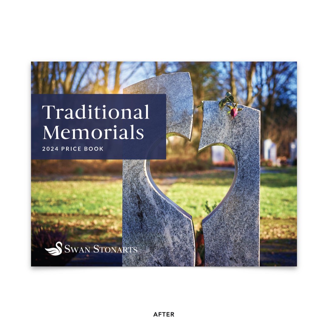
Swan Stonarts is a leading monument wholesaler, proudly serving the memorialization industry with the highest quality products and services for the past 25+ years. In preparation for a new season of trade show appearances, they wanted to update their pricing catalogs and flyers. The previous catalogs had been designed in-house, and the marketing team wanted a more elevated catalog to show prospective customers. The pricing tables were very dense due to the number of stone color variations and the size of their product catalog. We set out to find a way to organize and present the information in an easy-to-understand way, while also maintaining the elevated elegance their brand is known for in comparison to their competitors.
role/skills
Art Direction
Print Design
Data Visualization
Project Management
Deliverables
3 Pricing Books
1 Pricing Flyer
The company carries a huge variety of markers and tablets in a range of sizes and stone colors, resulting in very dense price tables. With this in mind, I designed the price tables to feel as light as possible by removing all cell borders except for the header row. I used alternating fills of white and pale blue to help distinguish between rows, making it easier for the reader to scan. Words and sizes are left aligned, while prices are right aligned, making them easier to read and giving the table an overall neater look than the previous center-aligned tables.
In addition to redesigning the price tables to feel less dense and easier to read, the client and I also chose to feature 3D* renderings of their products, making it easier for their customers to know what products the pricing tables are referring to. Their clients are often salespeople who sell products directly to consumers, and it’s important to everyone’s sales that they are empowered with easy to understand sales tools.
*3D product renderings were produced by the client’s in-house 3D designer.
For the mausoleum price flyer, I used the same tactics to make the price tables feel as light and elegant as possible, however for this flyer, I chose to break the info up into individual tables for each product. This allowed me to feature a product image for each product, and gives the flyer a more interesting layout than just a plain text table taking up the entire sheet. When designing for this client, I always try to keep in mind that the goal for many materials is sales enablement for unaffiliated salespeople who are much less familiar with the specific products Swan Stonarts offers. The goal is for the materials to be as easy to understand as possible, and to also be attractive and presentable enough to be shown to the end consumer.


